
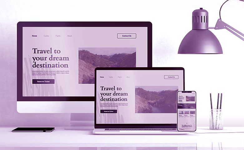

Create responsive digital experiences that adapt seamlessly across desktops, tablets, smartphones, modern browsers, and other connected devices.
We build responsive websites, portals, dashboards, and digital interfaces that adapt seamlessly to different screen sizes, browsers, and user environments. With responsive web development, mobile optimization, and front-end performance enhancements, we help businesses deliver consistent user experiences everywhere.
The Goal
Responsive UI development focuses on creating digital experiences that automatically adapt to different devices, screen sizes, and browsers. With responsive web development, mobile responsiveness implementation, and front-end optimization services, organizations can ensure users receive a consistent and high-quality experience regardless of how they access a platform.
A responsive experience improves usability, accessibility, engagement, and performance while reducing the need for separate device-specific solutions.
Key Benefits
Problems we have solutions for
What are the solutions
We build websites, portals, and interfaces that automatically adapt to different screen sizes and device types.
Optimize UI layouts, content, navigation, and interactions for mobile-first usability and performance.
Ensure digital experiences work consistently across every browser and operating system.
Polish interface behavior and interactions to provide a consistent user experience across devices and screen sizes.
Refine front-end performance, responsiveness, and usability to create faster and smoother user experiences.
Improve page structure, spacing, visual hierarchy, and layouts to enhance readability and usability across devices.
FutureSoft India designs and develops responsive interfaces that perform consistently across real-world devices, browsers, and screen sizes. Our front-end development approach focuses on adaptive layouts, mobile usability, and cross-device reliability, so users receive a consistent experience wherever they access the platform.
Let's build better
Design and develop responsive websites, portals, and digital products that perform consistently across devices and screen sizes.
Discuss Your Responsive Design RequirementsStay Connected to Global Success


